"Vibe coded"
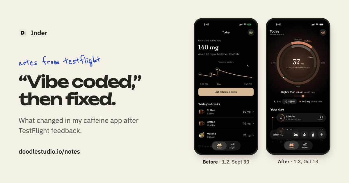
The comment was about Today. It was a stack of cards on a black background, and TestFlight feedback said it looked "vibe coded." Fair.
So I took the boxes away. In that version, caffeine showed up as a glow that followed whatever was active. I replaced the cards with a line for the day, with each drink shown as a capsule, and used Liquid Glass for the controls.
A dial with ten layers
The dial in the middle of Today had about ten layers. The ring's thickness was supposed to show caffeine, and testers didn't read it that way.
I changed it to two labeled rings, caffeine and sleep, with the overlap drawn brighter. Underneath, I replaced the sentence comparing tonight with your usual with a Lower, Usual or Higher marker based on your own nights.
Six ways to add a drink
Today had six entry points into the same task, plus a separate "Log an earlier drink" path with its own look. The first fix made Check the one way in, with a When row that defaults to now and also covers drinks you already had.
Two days later, the warm-glass redesign narrowed it again. The "What if…" dock at the bottom of Today became the one control that stayed there. Tapping a drink started a preview, and Adjust opened the same Check sheet.
A chart nobody could read
The Check screen had an "If you wait" chart with unlabeled bars that always went up. Testers couldn't read it. The same screen also showed two numbers side by side, caffeine in the deep-sleep hours and caffeine at bedtime, and testers saw them as two competing answers.
I put the inputs first, kept one answer, and shaded the hours it covered on the curve. I deleted the wait chart.
The morning check-in
The morning check-in used to ask how rested you felt with five faces, and it felt like a survey. I changed it to a sun that climbs an arc through the same five ratings. Once you'd answered, the card folded into one row.
What changed overall
Almost every fix was a deletion: boxes, layers, entry points, a chart and a second number. Onset has changed again since then, and the app is free on the App Store.